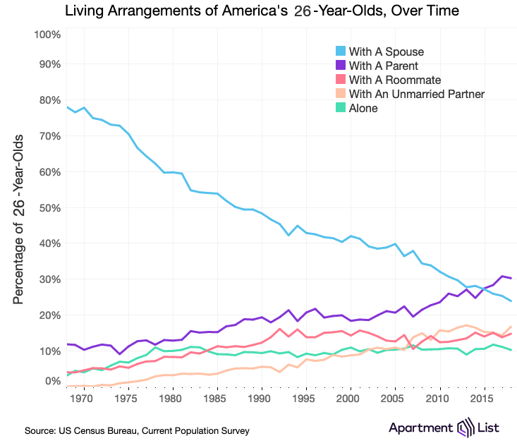
If you’ve had to move back in with your folks due to lack of money, lack of housing, or lack of a better option, you’re certainly not alone. The US Census Bureau has all kinds of data on the way Americans live and have lived for many years, and Apartment List has turned some of them into a series of charts. For example, a 26-year-old in America is now more likely to live with his/her parents than to live with a spouse. But the marriage rate has plummeted in the last 50 years, and 26-year-olds are also more likely to live with a partner, or roommates, or alone than they were 50 years ago. The chart pictured above is interactive at the site, so you can plug your own age in to find out how your living arrangement compares with others and with those of that age in past years. Another chart allows you to look up statistics in your metro area. There’s also a chart that shows how things have changed since the recession of 2007. And there are other charts that look at the data in different ways. Check them all out here.
[via Boing Boing]

