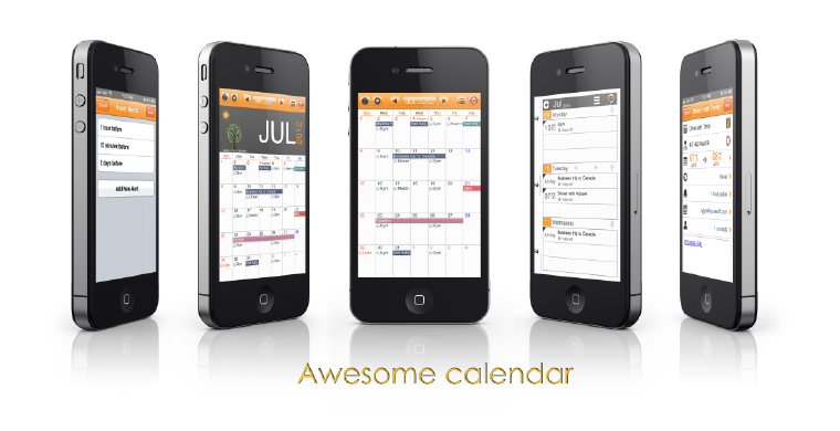
Let me begin this with saying that I have not been commissioned to write this article and I’m merely writing it because I’ve started using the app and therefore want to share my experience and opinion on it. Because I’m kinda thinking this calendar deserves the name it’s been given.
I’m a reformed Mac fan. I still own a Mac, iPhone and iPad, but I no longer live in the Apple software ecosystem. There was a time I thought that iCloud would be the validation of my Apple fanboy attitude, but I have to say it let me down. I found its updates slow, many features were simply clunky to me, and I didn’t like the fact that importing other emails into my Apple Mail meant I couldn’t view them on a browser.
Since the company I’m co-founding has been set up with Google accounts, I switched my life to Google — the whole shebang. I import all my various mail into my Gmail, where they get labels and are kept (mostly) tidy using Gmail Labs “Multiple Inboxes”, and I switched to using Google Calendar. I ditched Apple Mail and downloaded the Gmail apps (which work amazingly if you ask me) and it’s all hunky dory – as long as I have an Internet connection. Which, thankfully, most of the time I do (or I make sure I do).
But I was having a small issue with using the Calendar. You see, I don’t particularly like iCal’s interface. It’s not colourful enough for my liking. So I went in search of a good calendar app to use.
I was using CalenMob for quite some time. It’s a great app – all the colour coding in all different views is retained (coloured dots in month view is awesome) and it all works really smoothly and syncs easily with Google.
The problem came when I wanted to use Google calendars from two different Google accounts. You see, I have my personal gmail (where I import a whole lot of other email addresses) and then I have my work email – which has its own domain. In other words, it doesn’t end in @gmail.com, but instead ends with @domainofmyworkplace.com, and I’d rather keep completely separate from the onslaught that besieges my regular inbox. You see, while CalenMob is great, I could only manage to sync it with one Google account (I have since realised that it does draw on the accounts you install through the Settings, but I’ll get onto that below).
So I went in search for another calendar app that works with Google Calendars efficiently and I came across Awesome Calendar. I tried it out and lo and behold – it was actually quite awesome.
You can easily add different accounts because instead of directly inputting your Google account details into the app, it just draws your calendars from the ones you set up under Settings > Mail, Contacts, Calendars. ‘
I have since realised that CalenMob also has this functionality (it automatically draws these calendars as “iCal” calendars, and then you have the option of syncing directly with your Google account as well). However, I am still sticking with Awesome Calendar because it’s got some other cool features I really like:
- Google Tasks integration: I’ll admit, I didn’t know Google Tasks existed until I started using Awesome Calendar but since discovering it, I don’t think I could live without a calendar that didn’t let me insert To-Do lists directly on each day. No more updating a physical whiteboard every morning for me! Though I do still like to use Asana to organise my life and work.
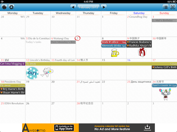
- Fun & colourful interface: while CalenMob, I would say, is neater than Awesome Calendar, I am one who enjoys a bit of fun, messy colours. There’s a little “sticker” feature where you can select from a bunch of stickers and tack em onto your Calendar. It looks great on the iPad and I have a lot of fun with it. Of course, all the coloured labels are also there, making my calendar a veritable smorgasbord of fun.
- Event/Note/To-Do: You don’t just have to create events, like you do in other calendars. When you hold down your finger it gives you a choice of creating an event, a note or a to-do. This I find particularly awesome because sometimes I just want to jot something down and it’s a pain to have to go through all the event details that calendar apps require when you create an event.
- Weather integration: There’s a bar at the top that can show you the local weather. You can also simply tap the bar and the weather appears in the boxes on the calendar for each day. You can swipe up to hide the bar if you want more space for the calendar too. Not a totally necessary feature, but a nice touch anyway.
- You can change the font: Again, not a totally necessary feature but a fun one. And good for those fontophiles who just can’t accept an ugly font.
The only real problem I have with the app is that it forces you to view in month view by default. You can double tap to rotate through day and week views, but that’s just a bit of a pain. Personally, I do prefer to view in month view anyway, so it’s not a big issue, but it would be a good feature to have.
The final word I have to say on it is that I’m quite impressed with their philosophy. Instead of withholding critical features from the free version to get people to pay, they’ve only kept one (which is to create recurring events) and given the option of removing ad support. That kind of attitude speaks to me like a “pay if you have the money, please” type attitude and I like it. I’m going to stick with the free version for a bit longer just to make sure it’s exactly right for me, and once I’ve decided that, I’m definitely going to buy the full version.
Do you have a favourite calendar app you care to recommend?


