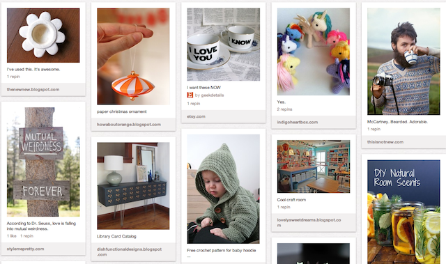
Okay, I’m going to be the first to admit it. There’s quite a few things I don’t like about Pinterest. I’ve written about it elsewhere, but I think I may have given the wrong impression. It’s not that I think Pinterest sucks. On the contrary: I think it’s awesome. I spend an inordinate amount of time browsing pins and, admittedly, it’s made a huge impact on my day to day existence. It just has a ton of room for improvement in some departments (and slowly and surely it’s getting there). Pinterest grew exponentially after its release, bolstered by the BFF status it shares with Facebook, and I think that was a detriment to getting it down perfectly (it’s now surpassed Yahoo, and is the 4th biggest traffic source online). I hear a lot of folks (primarily dudes) who lambast Pinterest for being girly and all pictures. I’ll get into that in a second but seriously, folks, hasn’t the whole “this is girly” thing gotten a little old on the web? Let’s move on. But the fact of the matter is that Pinterest gets a whole lot of things right, and it’s good to give credit where it’s due.

My “Random Fun” Pinterest board. Image by: Natania Barron
So, first things first. Pinterest is pretty. Did I just use that whole “girls like pretty things” argument? Yes, yes I did. Because it’s true. It’s not just that we like shiny things, it’s that we’ve got good taste (or, at least, a large portion of us do since we make up 80% of the user-base). Seriously, so much of the Internet looks like it was designed by lobotomized chimpanzees with absolutely no concern for aesthetics, organization or, heavens forbid, UI. Pinterest clearly got this right from the start. Uniformity. Sleekness. Ease of exploration. It’s made for you to get in there and see everything, more or less, on the same page. Great pictures look wonderful. Awful ones look awful. It puts everything going into it on the same page, both literally and figuratively. And sure, maybe it brings you to a page in comic sans with sparkling angel gifs and a looped midi of “Amazing Grace” that had you reaching for the eye bleach–but the pin looked awesome.
When you move beyond the design it’s all bout the ease of use. The mobile app started out pretty clunky, but in recent iterations I’ve learned to love it. In fact, I do most of my browsing and pinning directly from my phone. I can pin my own photos, and it’s really easy to drill down to the categories that fuel my geeky obsessions. Every new update brings new functionality, and I’ve got to say I really have almost zero use for the web version now that it’s such a pleasant experience on my iPhone.
It’s all about conveniently digestible content. In the last five years content aggregators have been a hot way to digest the internet. The Stumbleupons and Diggs and Reddits get content in front of our eyes. But let’s face it, it isn’t always pretty to look at, and unless something’s really on fire you’re not likely to get wind of it. I’ve got two kids. My job is writing on the web. Sometimes the last thing I want to do is sit in front of more text–and when I do, I don’t have a ton of time to do it. But slap a gorgeous image of something up on Pinterest and my interest is piqued. Not to mention it’s on my phone and not in front of a computer screen. Like Flipboard (my other must-have-or-I-will-lose-my-sanity-app) it puts the web in perspective. It takes chaos and makes it delightful. There’s no price on that.
Social! Social! Yes, I hate this word as much as you do. And sometimes, when three friends are planning a wedding, I really want to destroy my friends board. I mean, it’s cute. But there’s a point where you really just don’t that much closeness to someone’s personal wedding preparations. However, there have been tons of things I’ve discovered through my friends’ boards–many of a wonderfully geeky variety–including clothes, books, projects, and experiments. Definitely a great way to either get to know people you don’t connect with as often on Facebook or, in the case of my friend Brigid Ashwood, delight in how impeccable her taste is (and how similar it is to mine). And, in the case of some things, I’ve recently started a board called “Just No” that, well, profiles some really hideous pages. Also cool? If you’re an author (like me) you can make boards that serve as inspiration for your works in progress.
It gets you off your arse. Sure, there’s fashion and arts and design. But my favorite section is, hands down, the DIY & Craft category of Pinterest. I’ve found tons of stuff around my house and improved it, or cobbled together ingredients to make my own dishwasher detergent, or embarked on a crochet project, because I saw it there. I’m a geek, so with a kid, it makes science a blast. So many intriguing ideas so perfectly presented. In a ten minute session I can get a recipe for home-made clay, soap scum remover, and contemplate an entire new bed set (for cheap!).
So we know what Pinterest is awesome at. The best way for it to get even better (and escape the “Pin now, read later” spam) is to get there, as users, and make it awesome. It’s to lend our hand to the developers and tell them what needs improvement. Better attribution, for one. Less spam, like I said. As geeks, the highest in the Pinterest echelon, it’s our duty to critique and improve rather than just sit around and gripe, don’t you think?
[Pinterest Cake Picture Source: ShardsOfBlue]


