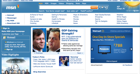
(Note: So, clearly, as pointed out in the comments, I reviewed the wrong site, and not the revamped one. I missed the fact that the site was being previewed and not entirely launched, which explains some of the non-streamlining… hehe. Entirely my oversight, and likely due to the fact I’ve been sick for over a week! However, the new page is still far from, um, groundbreaking–while it has a few less links, it’s still far from cohesive. Instead of blue, they went for white. What it reminds me of now is Yahoo!, in fact, and their attempt for the same “streamlined” approach earlier this year. Have a look for yourself, and tell us what you think.”)
I don’t think I’ve visited MSN.com since, oh, maybe 2003 or so, and then it might have been by accident. I think it was the default browser on my parents’ PC or something. Suffice it to say, I was familiar with the rather cluttered, bold colored page MSN has been known for the last ten years.
This morning, though, I read that the site has apparently gone for a facelift, attempting a more streamlined look. So I went for a look myself, admittedly curious. And yes, it has been streamlined. Sort of. I mean, they’ve integrated Bing, which is important from their standpoint I’m sure. But it still has tons of links (read: not streamlined–unless by “streamlined” you mean “blue”. In which case, sure…). But the color scheme and general flow of the page struck me as odd. At first I couldn’t put my finger on what it reminded me of…
Then it hit me: it looks just like Walmart‘s rebranding effort. It was made even more obvious when I noticed that there was in fact, an embedded Walmart ad right on the page! I had mistaken it for the actual format of the page. Oh dear.
MSN is by far the first (or I fear last) site to go for a 2.0 facelift and do it wrong. My main issue? The way the site is structured, above the fold looks like an advertisement and not a gateway for news. And at the top left corner, I’m greeted with another one of those damned “Yellow Teeth Cured! Read the Trick!”. No awful picture, but camouflaged in text. Then: links. Links and links and links. Nothing feels particularly intuitive or ordered. I expected that of Yahoo!, guys (whose new site structure, I should note, is far more offensive than the new MSN–it’s so bad that I routinely avoid it now).
So, my point of confusion: streamlined and cluttered? How’d that happen?
Reading the BBC article on the subject was definitely enlightening, as it quoted Lisa Gurry, senior director at MSN. She had this to say about the change:
More than half of people online start their sessions on sites like MSN and they told us they want simplicity – yet still want the latest information and their favourite services delivered together.
Ah, okay. I see what you did here. You wanted a ton of information clumped together in a streamlined fashion. So basically they tried the impossible. I can totally see the first iterations of the streamlined site, and the executives talking to the designers in a droll, Office Space kind of tone: “Mmm… okay. So, we like the simplicity but really, it’s got to have a ton of information there. All on the site. More links, more images, more ads. A streamlined gateway of tons of information. And a search. Oh, and make it look like Walmart. Great.”
Tags: MSN, msn.com, rebranding, Web

